ABSTRACTION

|
The relationship between photography and abstraction can be quite fascinating. Unlike other visual art forms which begin with a blank space that has to be filled, photography begins with a world full of information. The job of the photographer is to select and capture a portion of reality in their own manner. Photographs are versions of reality. They are flat. They have edges. Photographs are artful selections. They are silent. In the early years of photography, certain artists understood this aspect of the medium and emphasised the abstract qualities of photographs and the disinterested eye of the camera. This tradition of abstraction in photography continues to the present day. Abstract photography takes away from reality and becomes nothing exact. Its not something literal and it draws away from recognisable subjects or appearances in the actual world. It doesn't have an exact meaning. So when you look at a photo and think to yourself, 'What is it?'.....well there you go, its an abstract photograph. |
The White Paper Test
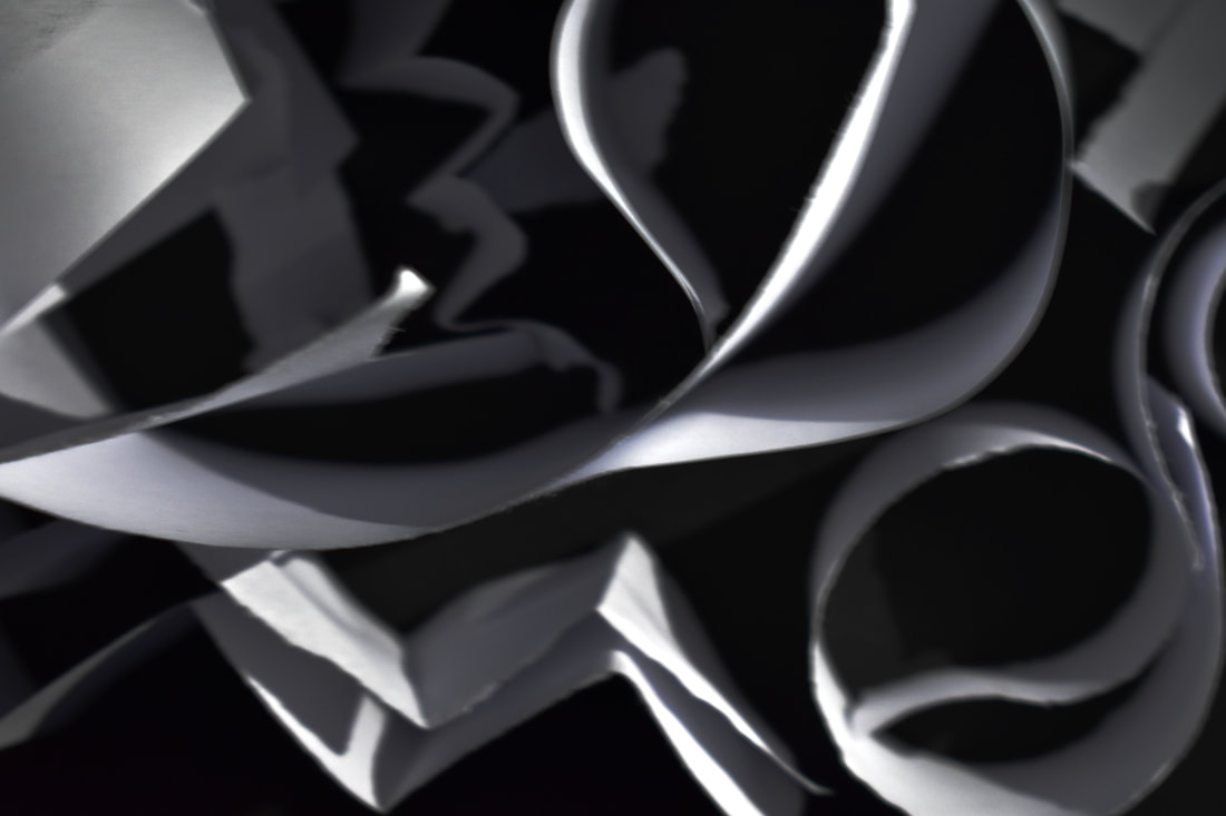
For our first project we were instructed to create at least 24 beautiful, abstract photos.
We can crumple, fold and roll it but we cannot tear or cut it. It had to be one single piece of paper.
We could explore different lighting including colour and shadows.
We can crumple, fold and roll it but we cannot tear or cut it. It had to be one single piece of paper.
We could explore different lighting including colour and shadows.
My Shoot:

|
For my shoot I used a torch as my main source of lighting with a backdrop made from a chair and some white/black card. I took into consideration composition, angles, my light sources and colours. I created a series of photos below which I think we're quite successful. |
Final Images:
WWW: I think I did quite well in this task as I created abstract photos of just one paper using colour, contrast, shadows and different types of lighting. For the colour photos I used a torch and put a piece of coloured plastic on top of it to project the colour I wanted. I really like pictures 1,5,6 and 10, as they look the most abstract out of all of them and have lots of shadows and contrasts to them. I really liked working with a black background instead of a white one as I think it brings out what Im trying to photograph even more. It define the shadows and paper even more.
EBI: To improve further, I think I could have crumpled the paper more as I mostly didn't do that; and tried to make them more abstract by trying to photograph different angles and look at other artists for more inspiration. I could also use a tripod and expose for longer so I could get even more detail in my pictures and make them less grainy.
EBI: To improve further, I think I could have crumpled the paper more as I mostly didn't do that; and tried to make them more abstract by trying to photograph different angles and look at other artists for more inspiration. I could also use a tripod and expose for longer so I could get even more detail in my pictures and make them less grainy.
Brendan Austin: First Response
|
Austins 'Paper Mountains' are situated on the border of reality and fiction, blurring the lines between photography and nature. Each 'mountain' he creates have been worked and crumpled to replicate the American West Coast, New Zealand and Iceland. He creates imaginary landscapes out of crumpled pieces of paper. They are called 'Paper Mountains'. He examines what humans mean by nature and how we have made an impact on it. He says, "The isolated desert city running on oil generators, the mars like landscapes of a volcanic environment and he mountains made from paper all attempt to start a conversation concerning the loss of meaning and reality". |
|


My Response:

|
|

|

|
WWW:I think that I did quite well in my Brendan Austin series of photos. In relation to his photos, I noticed they had some extra colour to them, maybe like sprayed paint so I went with that idea and highlighted the creases of the paper with some blue paint. I worked with the angles and used a white backdrop. I also tried to add some depth. EBI: I could've tried different patterns of paper and tried a black backdrop too. Also used a higher ISO as the images look a little soft to me. |
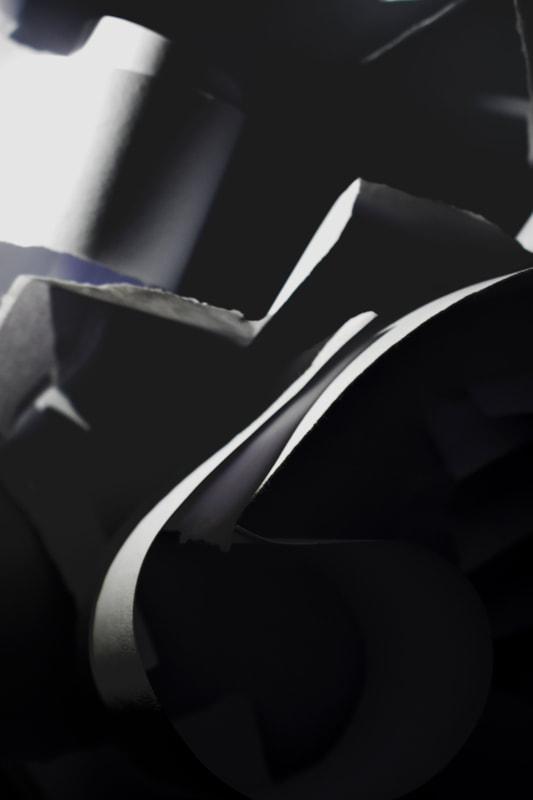
Francis Bruguiere: Second Response
|
Born into a wealthy San Francico family, youngest of 4, Francis became interested in many types of art and even became an accomplished pianist. Once he returned from Europe, he started studying paiinting and met AlfredStieglitz at the 291 Gallery in New York, he soon took up photography. Although he Bruguiere was an American Photographer who moved to London in 1928 where he began to experiment with non-representational photography. The cut paper abstractions he presents are particularly beautiful. Francis exploits the endlessly, subtle qualities of both paper and light. He manipulates them in order to create complex patterns of texture and form. |
|


My Response:

|
|
|

|
|

|

|
In order to create these images I used a white background as a base. I used about 2-3 sheets of paper and cut them into strips of paper to make zigzags and curves of different sizes. I then turned all the lights off and used the flash on my phone. I held it from different angles but mostly low angles. My intention was to create a series of abstract photographs as I wanted to further explore 'The White Paper Test'. WWW: I did well in making an everyday object something abstract and more interesting. The images I have made close are quite similar to Bruguieres photographs. In my composition I placed them in a specific manner where everything wasn't too close or too far apart, I also placed them randomly as I got further into the shoot. I shot on landscape mode in order to try and get everything in focus. I also at certain times prioritised my shutter speed lower in order to get more movement. My images express my intention which was to capture a series of abstract photographs inspired by Francis Bruguiere. EBI: To further improve I would try using different shapes and try two light sources instead of one to get manipulate the shadows and tones even more. Id like to achieve a more abstract, unrecognisable piece of work. What I mean by this is that when someone views my work, I don't want them to be able to recognise that Im using paper as my main 'subjects'. |
Edward Weston
Weston creates modernist images. He does this by using a large-format camera to make sharply focused and richly detailed black and white photographs. He helps bring the medium out of the Victorian Age that favoured pictorialist imitations of painting and into the Modern Era where photography became a celebrated medium in its own right.
He was a 20th-century American photographer. He was called "one of the most innovative and influential American photographers and one of the masters of 20th century photography". He was best known for his sharply focused images of natural forms and landscapes. It's said that he developed a "quintessentially American approach to modern photography" because of his focus on the people and places of the American West. He was always extremely precise on how he framed his images, a 'master at composition'.
Weston was born in Chicago and moved to California when he was 21. He knew he wanted to be a photographer from an early age, and initially his work was typical of the soft focus pictorialism that was popular at the time. Within a few years, however, he abandoned that style and went on to be one of the foremost champions of highly detailed photographic images. Some of Edward Weston’s most famous work were close-ups of vegetables and fruit, photographed in a way that captured the “essence” of the object by taking them out of context. By creating photographs that transformed his subjects into abstractions of shapes and patterns, he helped to bring photography out of the shadow of painting and stand on its own as a credible art form.
|
Edward Weston used a 2.5 by 3.5 negative Graflex camera. This camera allows him to see his subject matter when he was photographing. It was a portable and handheld camera. To produce the shutter speeds that allowed Weston to get his highly focused images, early Graflex cameras employed a cloth shutter with a narrow slit that quickly moved across the film plane, exposing only one small strip at any given moment.
|
|


Contact Sheet:
|
Evaluation:
In this task I was required to follow in the footsteps of Edward Weston by capturing the intricacies of different fruits and vegetables. This task explores composition, shadow, light, form and tones. During this I was able to learn further about all these different techniques. To create my images I used a tripod, a black backdrop and a torch. WWW: I photographed all my images in focus using the lowest ISO at 100, low aperture of F36 and exposed for 8-30 seconds. By doing this I avoided any grainy shots and had all focus and control over what I did. I positioned my torch on either the left or right side of my subject. This helped me manipulate light, shadows and tones. EBI: Edward weston sometimes photographs his subject in plain ceramic bowls or even more upclose as seen above. The shell shot is vey close up filling up the entire frame. I could also try finding more interesting fruits like Westons and try shooting from above too. |
My Response:


|


|

|

|
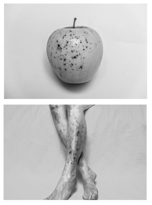
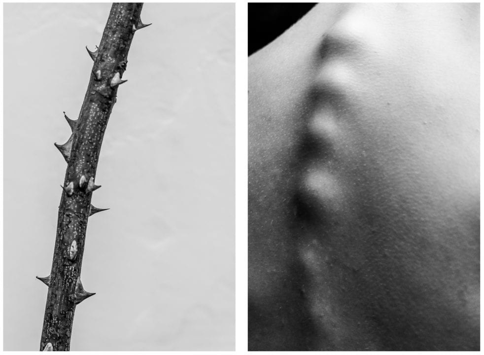
Alicja Brodowicz
Brodowicz is a polish photographer who looks for similarities betweens humans and nature. She photographs the human body looking for things like hair, scars, textures, wrinkles, veins and imperfections that can correlate with nature. Nature such as water, grass, bark, leaves, converging lines; similarities.
The writer Alice Walker said: “In nature, nothing is perfect and everything is perfect. Trees can be contorted, bent in weird ways, and they're still beautiful.” By re-tracing the unity of formal elements, compositions, lines and shapes in the form of diptychs, the inter-relation of the human body and nature becomes apparent.Brodowicz claims: “I photograph nature – the macrocosm, surface of water, grass, tree bark, dry leaves. I combine the two images, looking for converging lines, textures, similarities in layout and analogies in composition between the microcosm and the macrocosm. I look for unity between the human body and the nature.”
The writer Alice Walker said: “In nature, nothing is perfect and everything is perfect. Trees can be contorted, bent in weird ways, and they're still beautiful.” By re-tracing the unity of formal elements, compositions, lines and shapes in the form of diptychs, the inter-relation of the human body and nature becomes apparent.Brodowicz claims: “I photograph nature – the macrocosm, surface of water, grass, tree bark, dry leaves. I combine the two images, looking for converging lines, textures, similarities in layout and analogies in composition between the microcosm and the macrocosm. I look for unity between the human body and the nature.”
|

|
In these images, she is not so close up but is able to spot similarities that we wouldn't take a second look at. I think that the apple comparison with the legs are especially good as they don't have the same shape but they do have a similarity through texture and appearance.
I have chosen to respond to Alicja Brodowicz because her images are really interesting to me. She captures unique similarities between us and nature and I think they're quite beautiful and eye-catching. |
|
My Response:

|

|

|

|

|
|
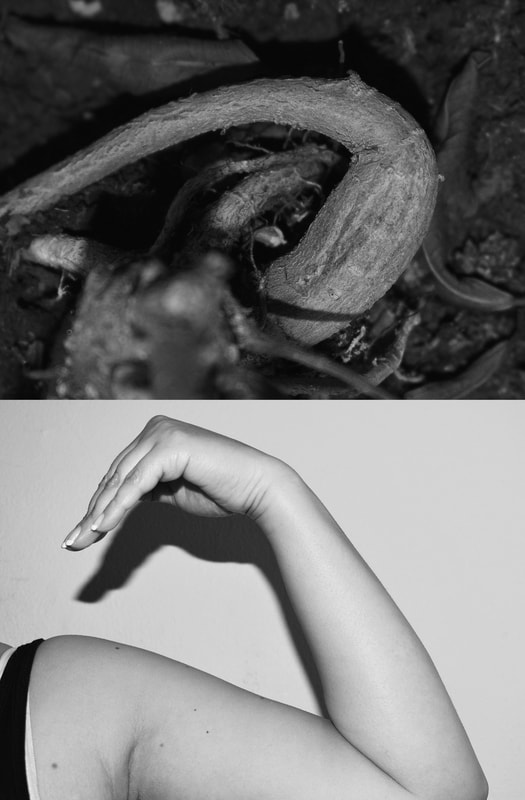
For this project I used objects I had at home. I tried to find similarities between our bodies and nature as Alicja Brodowicz did. Similar to her, I changed my photos from colour into black and white. I also raised the contrast and shadows to get more definition in my photographs. In photoshop I also places my 'human' pictures and my 'nature' pictures together using photoshop.
WWW: I think I did well with my the pictures I took. They are quite similar and I put a lot of thought into trying to find similarities between them. I managed the exposure well and controlled my aperture so that my photos would be in focus. My intention was to make sure that what I was comparing was obvious and easy to interpret.
EBI: I think next time I will go outside and try to find more objects to compare to. I will experiment further with composition and depth as well as trying to find different angles that you normally wouldn't think to compare with nature.
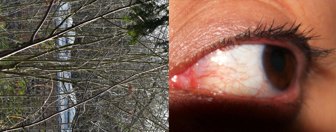
Agnieszka Lepka
Lepka is a similar photographer to Alicja, however her work seems to be more close up by going into details that would seen fairly ordinary if you saw it without thinking much of it. Veins look like topographic maps, fingerprints resemble tree trunks and cacti can be compared to stubbly beards.
|
In these particular images, Agnieszka Lepka's style differs from Alicia. She focuses more in-depth on the body and more close up. For example the photograph of the eye and lighting is definitely something that I think a normal person wouldn't be Abe to pick up. She made her subject raise their eye up which we don't get to see in our everyday lives.
|


My Response:

|

|

|
|

|

|

|
WWW: Im really happy with his my images turned out and would like to experiment further wit this type of photography. I successfully used close ups and focused my subjects well birder to not get any blurry photos. I adjusted the colours and saturation in photoshop my photos looked even better and cropped the RAW photos as necessary so my images were focused on what I wanted to be shown. I also used my composition well and positioned my subjects where I wanted them to be. In order to get my nature shots I walked around my local area and tried to find good matches. I think I did quite well in relating my work back to Agnieszka Lepka. Her photos are always in colour and very close up.
EBI: I think next time I could zoom in a bit more on photos like the eyes and spines of the plants. I could also experiment further by comparing my work ago a different artist and further improving my images.
EBI: I think next time I could zoom in a bit more on photos like the eyes and spines of the plants. I could also experiment further by comparing my work ago a different artist and further improving my images.
Gallery Visit
I went to visit a gallery with my friends in 'The Photographers Gallery' called 'For the Record: Photography and the Art of the Album Cover'. We got in for free and when we got there, we were told we could visit the other 3 exhibitions they had on too.
|
'For the Record: Photography & the Art of the Album Cover' celebrates the unique ‘object d’art’ that is the Album Cover and reflects upon its role in shaping and making artists - both in front of and behind the camera. For the Record brings together over 200 album covers, highlighting the central role photography plays in defining artists and bands, and showcasing some of the most iconic album covers of our times. While many of the ‘artistes on the covers will be instantly recognisable, the exhibition illuminates the often overlooked and multifaceted contributions of photographers and other visual artists to the identity of the ‘stars’ and the labels themselves. Featuring work from such photographic and artistic luminaries as Andy Warhol, Cindy Sherman, David Bailey, David LaChapelle, Ed Ruscha, Elliott Erwitt, Guy Bourdin, Helen Levitt, Irving Penn, Jeff Wall, Joseph Beuys, Juergen Teller, Lee Friedlander, Nan Goldin, Richard Avedon, William Eggleston and more, many of whom had their careers launched through their cover images, |
|
1st Exhibit


2nd Exhibit


3rd Exhibit


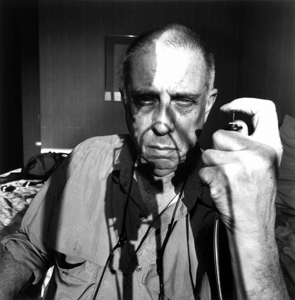
Abstract Portraits: Bill Jacobson
|
Jacobson is a 67 year old American photographer. He received an MFA from the San Francisco Art Institute in 1981. is widely known for his out of focus photographs of both figures and landscapes. He began to take them in 1989. He called them 'Interim Portraits' as they featured shadowy, pale figures tat evoked the loss experienced by many during the height of the AIDS epidemic. Its like capturing a portrait and memory in one. His work is feature is in the collections of Guggenheim Museum, the Metropolitan Museum, The Victoria and Albert Museum and many others. In 1999, Jacob switched to colour and began photographing urban and rural landscapes in 'Untitled' and 'New Years Day'. These pictures reference the uncertainty of the minds eye rather than the sharp clarity of the cameras lens. A monograph of this work was published by Hatje Cantz in 2005. |
|


Contact Sheet:

|
My Response:

|

|

|

|

|

|

|
WWW: I successfully created images similar to Bill Jacobson. I manipulated exposure, light, shadow and aperture. I manually unfocused my images and told my subject how to sit and pose so I could capture my photographs. I think I used a perfect amount of blur. In photoshop I changed my photos to black and white, although for some photos I did actually shoot in black and white to start with. I am very happy with how my photos turned out and would love to try again.
EBI: I could've used a tripod to maintain the balance and correctly use composition in my images. Next time I will relate my work back to another artist and try to use some originality and try different poses as opposed to the ones that Bill Jacobson used.
EBI: I could've used a tripod to maintain the balance and correctly use composition in my images. Next time I will relate my work back to another artist and try to use some originality and try different poses as opposed to the ones that Bill Jacobson used.
Second Response: Erwin Blumenfeld
|
|
Blumenfield was an American photographer of German origin. In 1907 he received his first camera from his uncle Carl. He was born in Berlin in 1897. In 1941 he emigrated to the United States where he soon became a successful and well-paid fashion photographer. He worked as a freelancer for Harpar's Bazaar, Life and American Vogue. In 1933 he made a photomontage showing Hitler as a skull with a swastika on his forehead; this image was later used in Allied propaganda material in 1943.
|
|


Contact Sheet:

|
Evaluation: WWW: I used patterned glass and good composition in my images. I also used colour on either the left or right sides of my subjects to achieve a more colourful photograph similar to Blumenfeld's. EBI: Next time I will try to find a bigger piece of patterned glass and use a cleaner one too so there's nothing disturbing my audience from seeing the whole picture. I will use add more saturation and colour to my images as Erwin Blumenfeld's pictures look quite saturated. Next time I will also incorporate the colour red as it seems to be used quite a lot in his pictures. |
My Response:

|


|

|


|

Third Response: Eliana Marinari
|
|
Eliana began studying Art at the Academy of Florence. She then moved to London to focus on her audio practice and her interpretation of realism in figurative painting at Central St Martins. Currently, she's based in Geneva, Switzerland where she continues in bridging the gap between art and science. Her artistic research brushes up against scientific studies by demonstrating the illusory quality of visual perception. This queries the truth: how the brain stores images, the way it recollects and how it interprets them. Her works been exhibited in Switzerland, Italy, the UK and the US.
|


My Response:

|

|

|

|

|
Evaluation:
WWW: I incorporated colour into my photographs as Eliana Marinari. In order to get the effect that she has, I used tracing paper to get a soft look. I set my model on a chair and asked them to put their face on the paper. I found that when they placed their head to the side more of their features were noticeable. I manipulated light, shadow and colour well and Im happy with the results I achieved. I also raised the brightness in images so the models facial features were more noticeable. EBI: I think I could've lowered the colours and used more chalky colours. I think next time I could blur my photos a little more like Bill Jacobson, so that my development on Eliana Marinari could be better. To improve I will ask my model to do different poses and positions so that my images can be more interesting to the naked eye. |
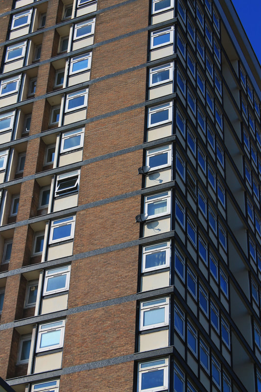
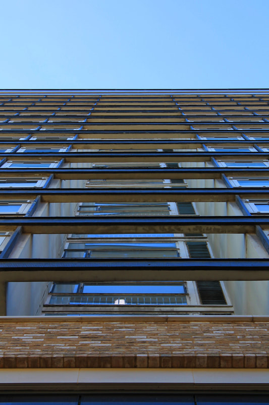
Ambiguity - Johnny Kerr

|
Johnny Kerr is from the United States and was born in 1982. He's a fine art photographer and art educator based in the West Valley of Arizona. His Statement: "Growing up in Arizona has certainly given me an appreciation for the unique beauty of the desert. However, I have never found my desert surroundings to be particularly inspiring in my artistic endeavors. Lacking the inspiration to capture my natural surroundings in a representational manner, I have found freedom and gratification in abstraction. I found architecture to be an inspiring subject matter for its graphic qualities, but my photographs are not really about the buildings. Each photograph is a study of the rudimentary elements that catch my attention: shape, space, volume, line, rhythm, etc. Drawing heavily from my graphic design experience, each architecture photograph represents an exercise in isolating those basic elements and trying to present them in a harmonious design. Often I have incorporated long exposure techniques to create images that seem to exist outside of the reality our eyes perceive on a daily basis. My goal has not been to abstract the subject beyond recognition, but to simplify, to pull it out of its usual context, and try to see the ordinary surroundings of city life in a new way. The lessons I learned from my exercises in abstracting architecture have also carried through into other subject matter, including landscape and seascape, helping me to find solace and inspiration in unexpected places." |
|
Johnny is best known for his abstract photographic ways that reveal the colourful poetry hidden amongst a seemingly mudane Arizona metropolis. Whats best about him as an artist is that he is a self-taught photographer. He did however start with many years of art education and design experience. He has a big appreciation for minimalism as it has the largest influence on his work. His imagery often explores the abstract qualities of his subjects, placing them to varying degrees, out of their literal context. His use of space reflects his affinity for quietude, while his continued evolution of style and subject matter represents an authentic pursuit of curiosity. He began his journey by learning and experimenting with photography in 2011. In 2013, he decided to shift his focus, pursuing photography as his main focus of expression. After he had decided to change careers, he went back to school earning his Master of Arts in Education degree. He now currently makes his living as a photography teacher in the greater Phoenix area, where he lives with his wife and daughter. |
|


Contact Sheet:
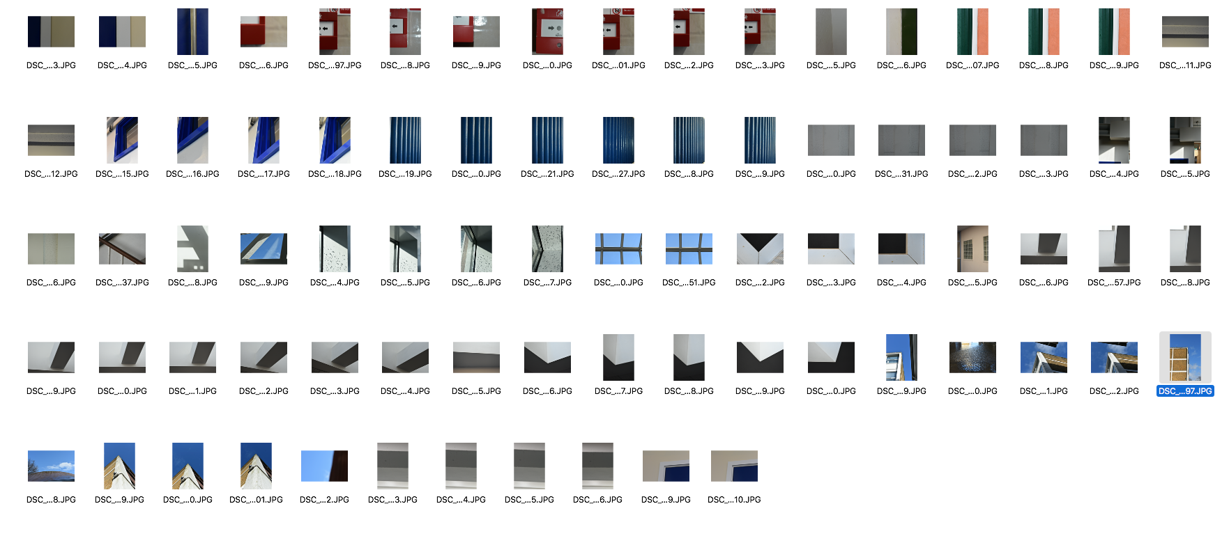
First Response:
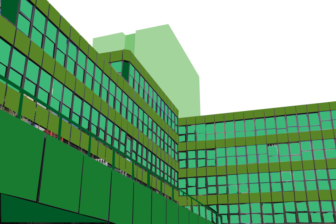
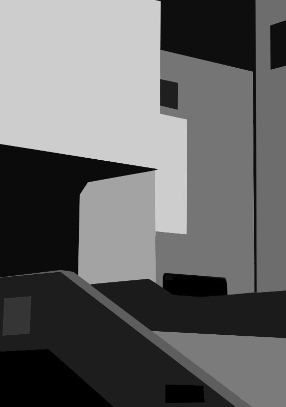
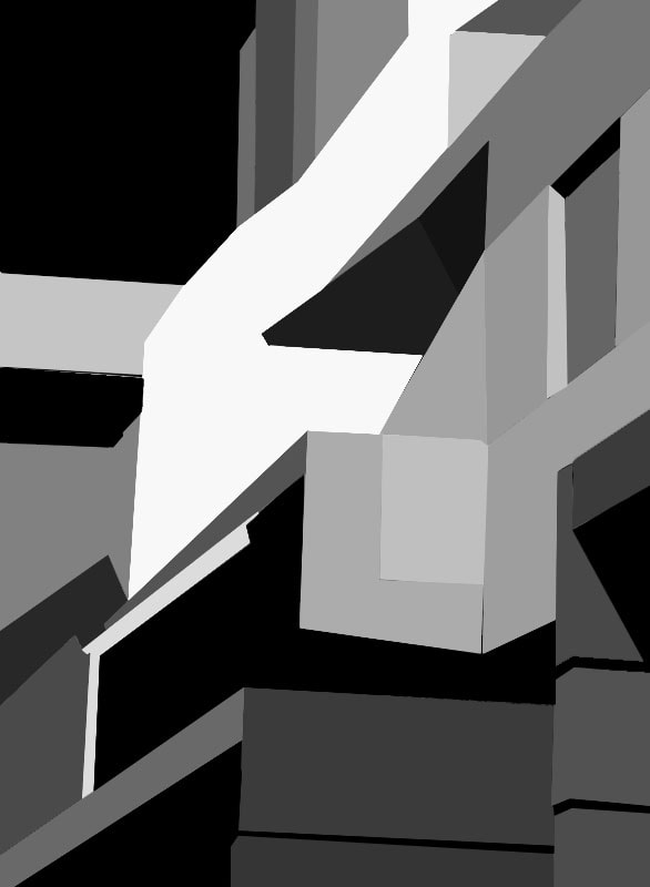
For my first response to the assignment, we were told to take at least 22 photographs inside the school with inspiration from Johnny Kerr. After taking our photos we were supposed to go into Photoshop and edit them so that they can have a flatter, more abstract appearance, similar to Kerr's style.
When taking there's photos I took into consideration lighting and composition. I took several pictures and chose the ones I thought had the best composition. I found that many of the best abstract areas there were was up high instead of down below. I shot ceilings, the sky and the top of buildings from a low point of view.
When taking there's photos I took into consideration lighting and composition. I took several pictures and chose the ones I thought had the best composition. I found that many of the best abstract areas there were was up high instead of down below. I shot ceilings, the sky and the top of buildings from a low point of view.
|
Process:
In photoshop I opened my images and created a new layer. I used the polygonal lasso tool and selected a specific area of the photo. I used the eyedropper tool to pick the colour of the section that I was going to correct. Using the pain bucket tool I clicked the area and filled it in. I then lowered the opacity to around 80% so it would just be a block of colour. I did this editing process with some of the best images I took and did it with as much precision and detail as I possibly could. I did this inspired by Johnny Kerr's work. |
|
Before editing:

|
After editing:
|

|

|

|

|

|

|

|

|


Extra:
|

|
Second Response:

|
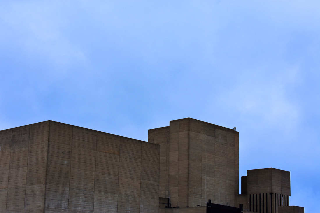
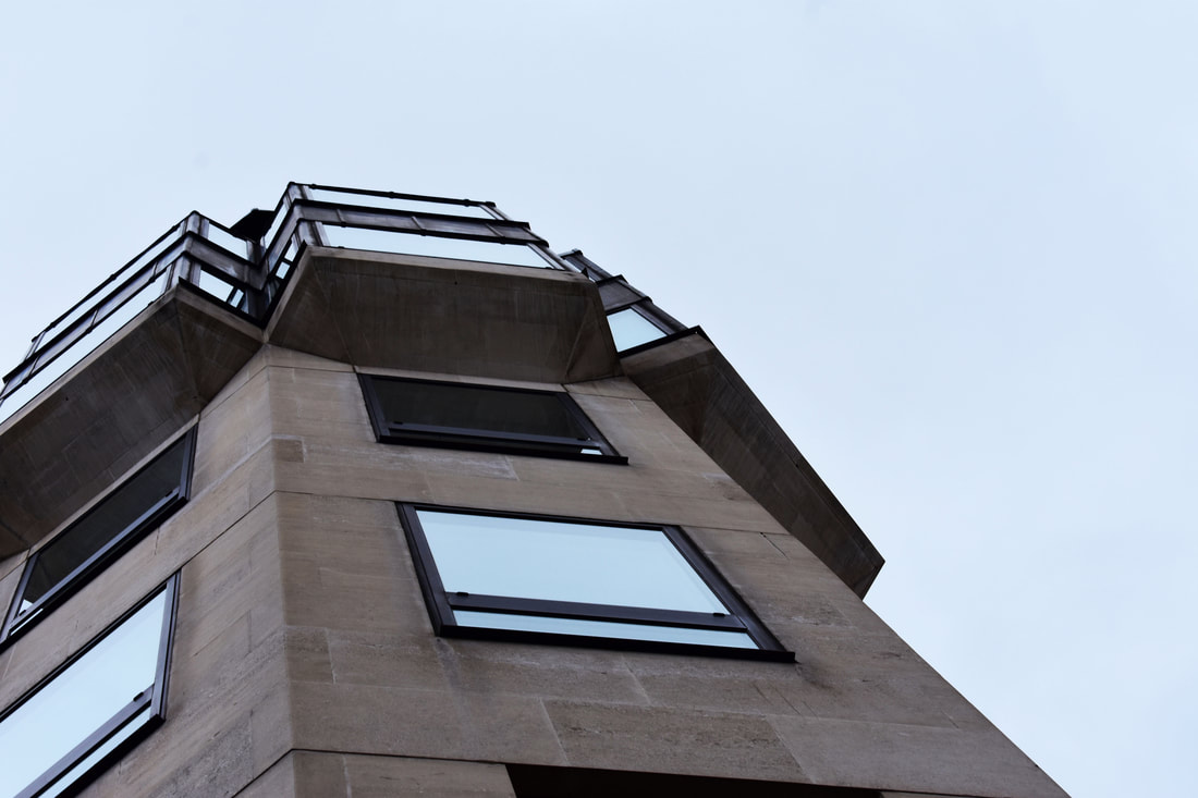
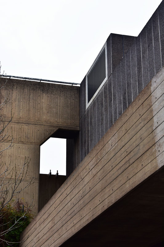
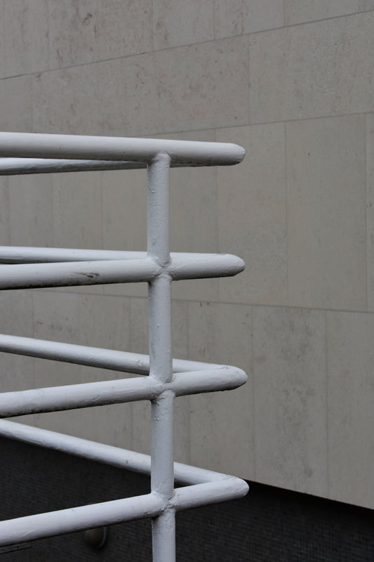
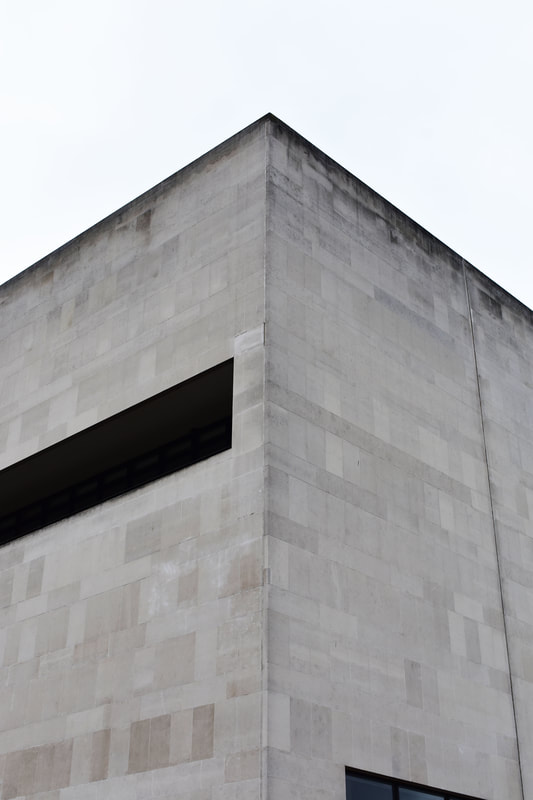
For my second response I went Southbank and shot the buildings there, there were also some brutalist buildings too.
WWW: I am really happy with the pictures I took, I manipulated well my composition, lighting factors and shadows. In photoshop I increased the saturation levels in some of photos and adjusted exposure levels too as some of the RAW photos were underexposed. EBI: Next time I could explore more areas in London and try to find colourful buildings similar to the ones that Johnny Kerr shot. |
|
|
|
|
|

|
|
|
Thomas Danthony

|

|
Thomas Danthony was in Montpellier, the south of France. He graduated from a Master in Product Design and now dedicates himself to illustration. He is a designer and illustrator based in London. Since then he has become a freelancer for the Press and for advertising clients such as Google, Arte, Netflix and Liberty.
His work often contains a narrative enhanced with the clever use of lighting that allows images to tell a story and the spectator think. He gets his inspiration from cinema, architecture, photography and painting. He is quite fond of the early twentieth century; he uses gouache to create his artworks. Through round shapes, solid colours and strong contrasts he demonstrates a great sense of detail and composition. |

|
My Response:
|
|

|
Process in Photoshop -How to Edit like Thomas Danthony
Abstracting the Environment..
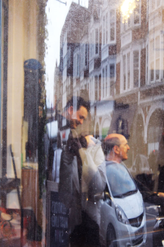
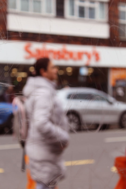
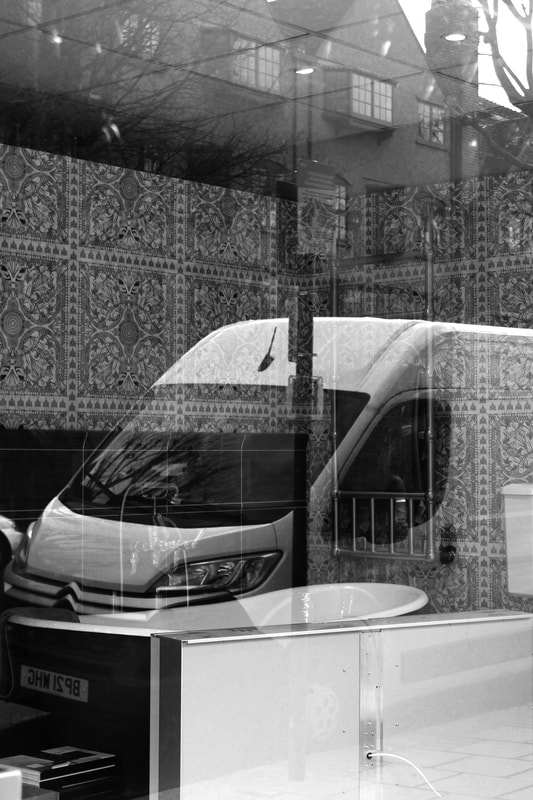
First Response : Saul Leiter
|
Saul Leiter was an American artist, he was born in Pittsburgh in 1923. His interest in the creative side begun in his late teens where he started painting. In 1946, when he was 23, he left his college in Cleveland and moved to New York to pursue painting. Not long after he moved, he met Richard Pousette-Dart, an abstract expressionist painter, who was experimenting with photography. By 1948, Leiter began to experiment in colour, largely using Kodachrome 35mm film. His main subjects were mostly his friends and street scenes. In the following years his work was put in various exhibitions including the Museum of Modern Art. Leiter then continued to work as a fashion photographer for the next 20 years was also published in Elle, British Vogue, Queen and Nova.
In the early 1980's, he faced financial difficulties and was forced to close Fifth Avenue Studio. In 2006, with the help of a historian called Martin Harrison, the groundbreaking monograph 'Saul Leiter: Early Colour' was published by Gerhard Steidl in Germany. What Leiter called 'his little book' became an overnight sensation with worldwide distribution and firmly established Saul Leiter as an early pioneer in the history of colour photography. In the same year, the Milwaukee Museum of Art held the first US museum show of Leiter's photographs. Then in 2008, Leiter travelled to Paris for his first European exhibition. In this same year he also had his first painting exhibition in 30 years at the Knoedler Gallery in New York. He passed away in 2013, leaving behind an immense archive of his life's work of art.
|

Leiter quotes from a 2006 interview:
“I happen to believe in the beauty of simple things. I believe that the most uninteresting thing can be very interesting.” “We live in a world full of expectations, and if you have the courage, you ignore the expectations. And you can look forward to trouble.” “I believe that there is something in you that strives for order, and within that order there’s a certain kind of mishmoshy confusion, and you bring this mishmoshy confusion, if you succeed, into some kind of order. There’s an element of control, and there’s also an element that just happens—if you’re very lucky. Artists need luck.” 
|


Contact Sheet:

|
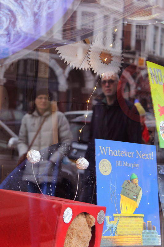
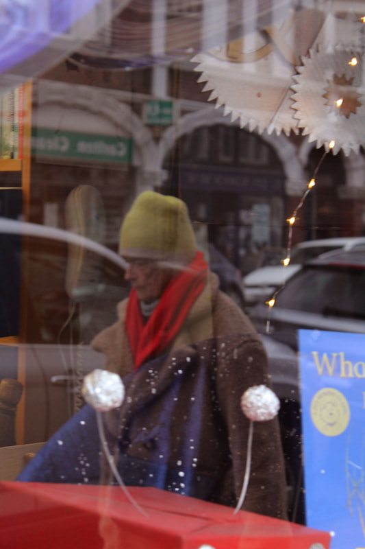
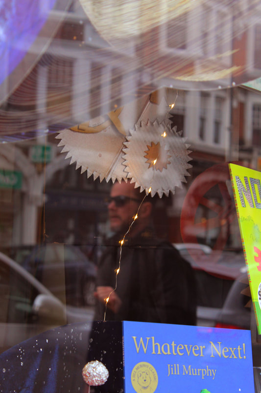
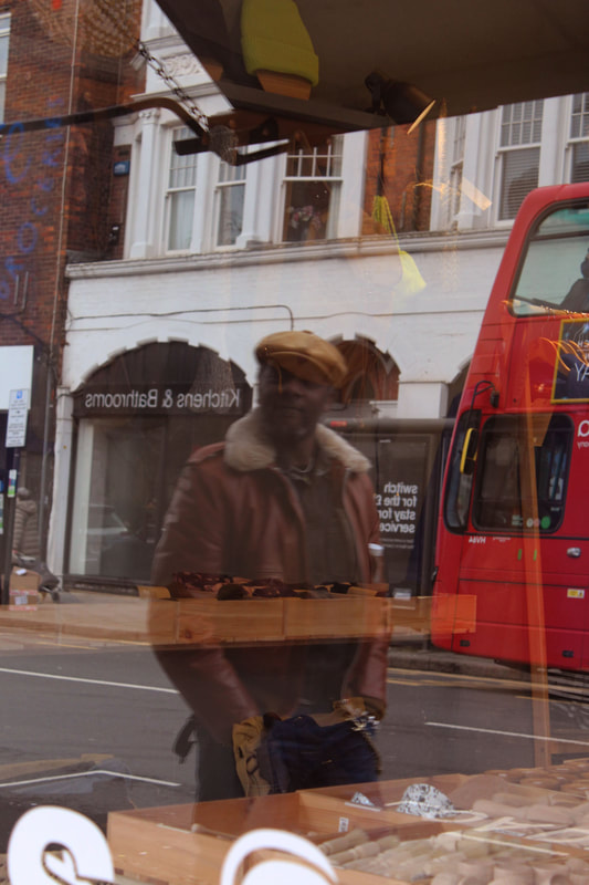
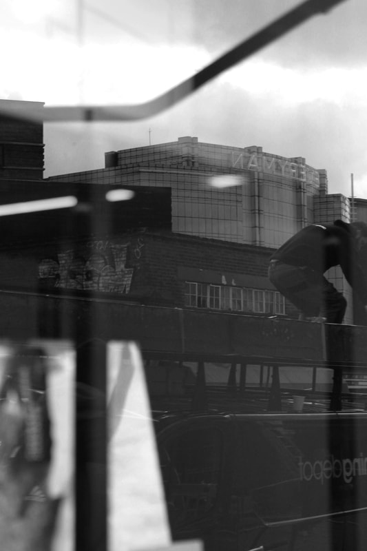
In this response I was required to take several pictures in the style of the artist, Saul Leiter. For this task I walked around Muswell Hill trying to capture different types of reflections in shop windows or reflective surfaces. In response to Saul Leiter, I changed the colour theme of my images to blues and yellows. I took reflections of people with the idea of capturing everyday tasks that weren't staged. |
My Response:
|
|
|
|
|
|

|
|
|
|
|
|
|
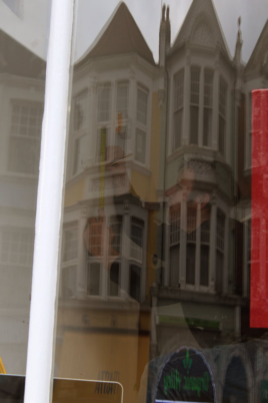
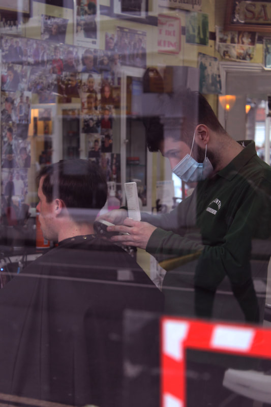
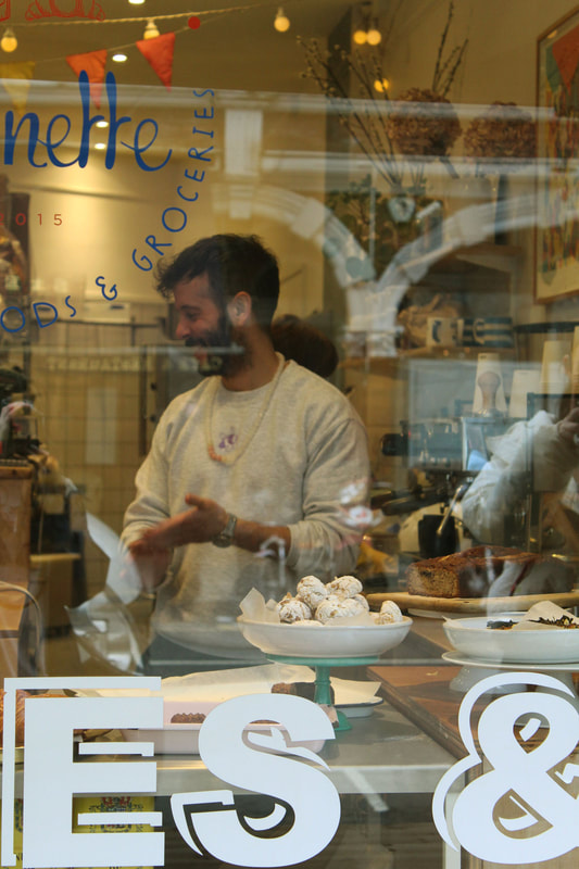
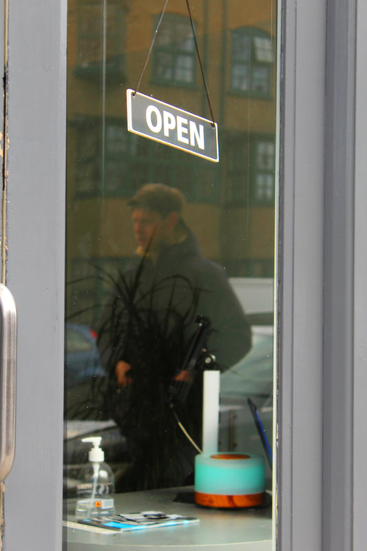
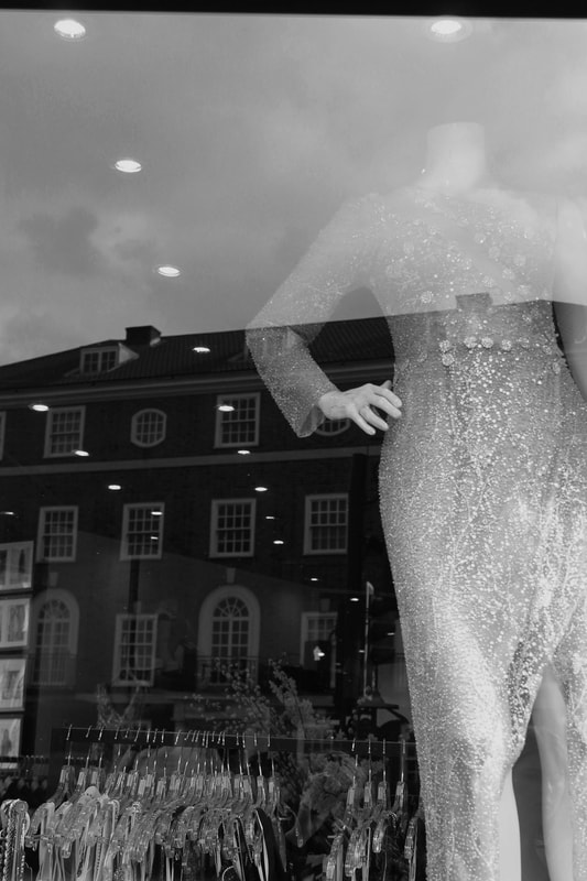
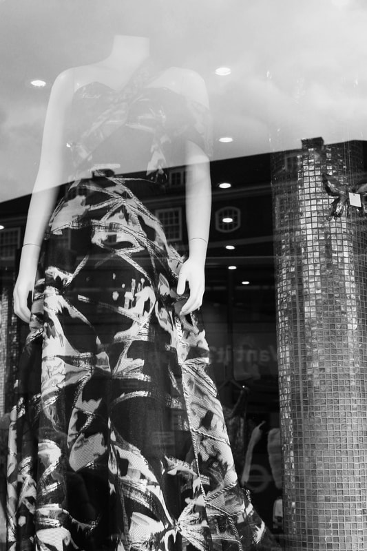
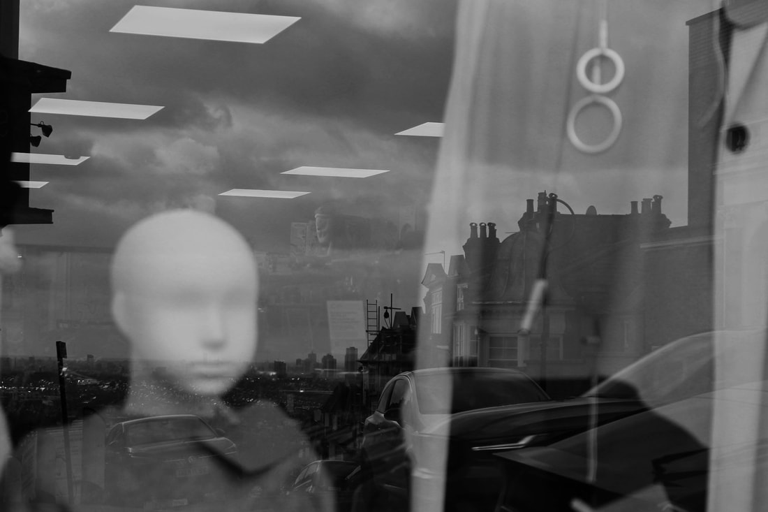
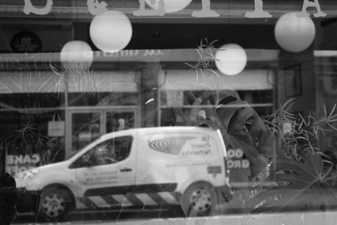
Second Response: Lee Friedlander
Friedlander is one of the rare artists in any medium to have sustained a body of influential work over five decades .Lee Friedlander began photographing the American social landscape in 1948. To make the photographs in Mannequin, he returned to the hand-held, 35-mm camera that he used in the earliest decades of his career. He roamed the sidewalks of NYC, LA and San Francisco, focusing on shopfront windows and reflections, which speak to marketplace notions of consumerism and fashion, while recalling Atget's surreal photographs of Parisian windows made 100 years earlier. Thoroughly straightforward, their unsettling and radical new compositions suggest photographs that have been torn up and pasted back together again in near-random ways.
Contact Sheet:

|
|
My Response:
|
|
|
|
|
|
|
|
|
|
|

|
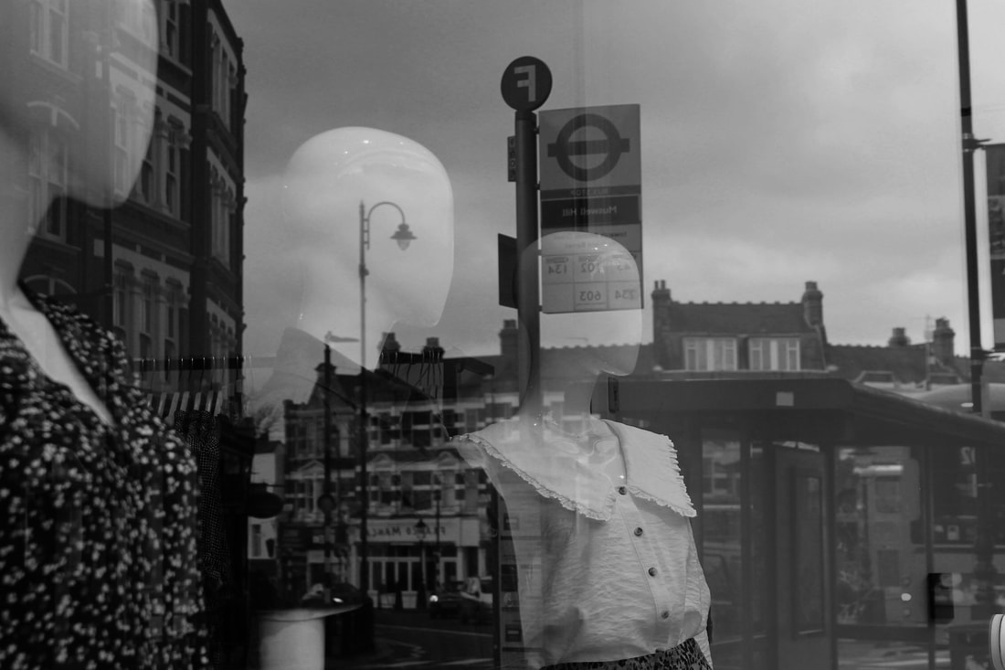
For my second response I took reflections of buildings through the shop window. I tried to mainly shoot on windows that had mannequins In them. I increased contrast, brightness and cropped my photos so that they looked correctly shot. By increasing the contrast on my photographs I got a more defined images so that both the mannequins and buildings reflected were equally seen.
WWW:I am pleased with the photos I took as you can see a good amount of Muswell Hill and the surrounding area. In photoshop I changed my photos from colour to black and white so that the colour wouldn't be distracting. I controlled my composition well and managed my exposure along with light and aperture. I used landscape mode on my camera so that everything would be in focus. EBI: It would've been nice to shoot on a day where there were clouds in the sky so that there wouldn't be too much blank spaces. However I still think they look good like this. |
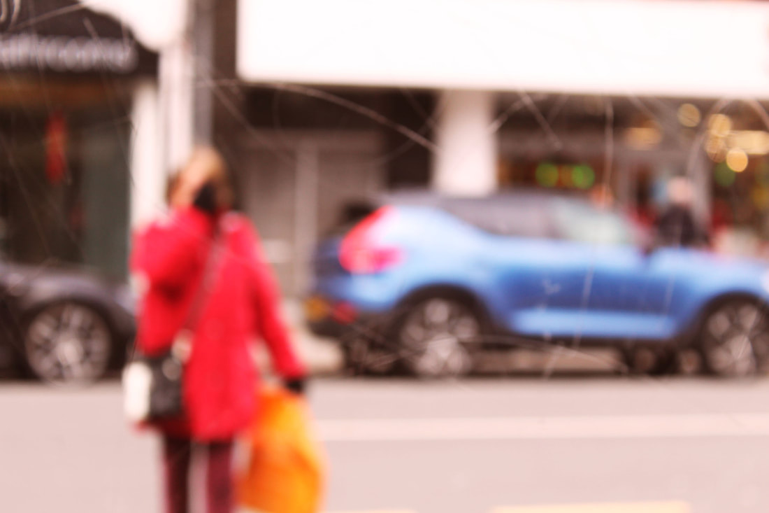
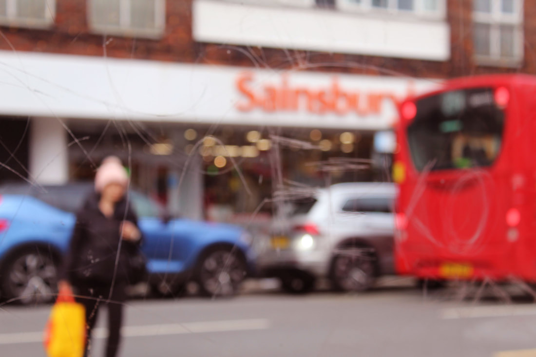
Stephen Calcutt

|
Stephen Calcutts unique form of street photography is a consequence of him frequently being around bus stops and shelters in Birmingham. We all know that graffiti is art however he feels that the graffiti scratched into the glass of bus stops are like a violation. These type of grafitti's seems to be different expressions of frustration, anger, love or hate. This contrasts with graffiti made on the walls which are actually considered art. Calcutta feels that a windows full potential as a clear barrier between yourself and the elements are compromised when the view beyond is obscured, distorted and blurred by the scratches.
Stephen uses these windows as a lens, he merges the graffiti and the view beyond, focusing his camera on the etched lines putting the view out of focus. It all merges into a single plane creating a new perspective. It swirls, zigzags, lines, curves and slashes across the abstracted view like paint strokes. At first glance, Stephens photos can be mistaken for abstract paintings. The human activity that he likes to capture is not very dramatic. It adds to his desire to create an image that ordinarily would go unnoticed. His photography challenges people to look at the issue of vandalism. |

|

|

|

|

|
Contact Sheet of my responses:

First Response:

|

|

|

|

|

|

|

|

|
Second Response:

|

|

|

|

|
Third Response:

For this development I tried a different form of what Stephen Calcutt does. He puts graffiti first then the subjects, so I tried to do the same idea by photographing a reflection of a subject on this wall. It made my subjects look kind of diffused, like it makes you look at the whole picture and not just the main subject. If you look closely, the images look like an abstract painting from a different angle. |


|


Fourth Response:

|

|

|

|

|

|
Final Best Images:
|
First Response: I replied to Stephen Calcutt by using his colour theme and incorporating warm yellow, purple-ish, red tones contrasting with blue tones too. I photographed by bus stops so that the grafitti would be in focus, however in some photos they weren’t.
WWW: I think I did well shooting by bus stops with candid poses. I choose a good aperture and choose good locations. One of my favourite locations was the cinema. EBI: Next time I will find bus stops with more strong, defined graffiti that I can focus on and use like Stephen Calcutt does. Second Response: I went to central london and found bus stops with more grafitti. I stayed here and photographed the passing strangers. WWW: I took my images into photoshop and increased the colour of my photos. I colour corrected them into more blue, red and yellow tones. I also unfocused my images slightly in order to respond to Saul Leiters photographs. EBI: Next time I will photograph more full body photos and not just the head. Third Response: For this response I found a wall that produced some interesting reflections. With this in mind, I took reflection photos of strangers through this. WWW: In response to Leiter, I tried a different method instead of graffiti. I think it turned out quite well as I manipulated my aperture and used a high ISO of 1600. In photoshop I increased the saturation of my images and the brightness too as they were underexposed. EBI: I think that next time I could take more photos and maybe even get some closer up photos of people by asking them to come over and do some candid poses. Fourth Response: I found a frame in central london and used it to my advantage by capturing strangers in the frame it made. WWW: I stayed here for about 20mins to get strangers in my frame, which i carefully composed. I corrected the angles of my photos in photoshop to straighten them up properly. I also increased the brightness and kept the background black. EBI: Next time I could use a tripod to keep my camera steady and in the same place every time. I could also adjust my white balance on the camera in the Manual setting. |

|

|

|

|

|

|

|

|
Chemigrams - Pierre Cordier
The whole chemigram process was discovered by Pierre Cordier on November 10 in 1956. He had discovered that a resist can hold back the chemical effects of developer and fixer on black and white photo paper for a time.
Paper put into developer that has been exposed to normal room light will turn black, except when a resist blocks the chemical reaction. The parts of paper that have been protected by the resist will continue to change colour from extended exposure to room light.
Paper put into fixer turns white, except where a resist blocks the chemical reaction. The protected parts of paper continue to change colour from the room light exposure and suddenly there is the possibility of black, white and colours in-between on normal monochrome paper.

|

|

|

|
|
Materials needed:
-developer -fix -soapy water -plain water -photographic paper -resists: honey, salt, coffee, vaseline, masking tape, lotion Method: 1. First you get a piece of photographic paper and put any resists you want on it. You place them in particular order, in an 'abstract way'. 2.Optionally if you want, you can spray either developer to get either a white or black background colour. 3. Once you are happy with what you've done, you place the paper in the soapy water to wash off any excess resists. 4. You then place the paper in the developer or straight into the fix, depending on what type of colours/how developed you want it to be. 5. After this, you wash off the paper in normal water and it's ready. You can then let it air dry. |

|
My Response:
|
Before developing:

|
After developing:


|


|


|
3 Strand Development
1st Strand - Alan Humphris
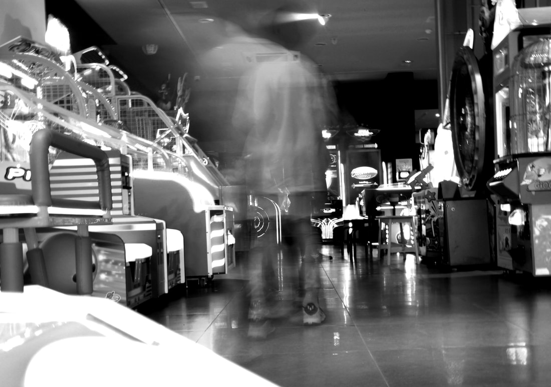
To take his photos he uses long exposure, normally using an Nd filter too. For around 2-4 seconds Alan moves the camera 'just enough' to create this type of effect. The idea is to abstract away the details so that the images are non-specific. For some of his photos, he would choose a main subject and stay trained on them instead so that they would become relatively less blurred. He says it would 'become quite a dance'.
Alan Humprhis used long exposure techniques to capture movement and the feel of the moment. He does abstract street photography the capture the look of fading memories. He stumbled upon the technique in 2008, discovering that he enjoyed the creative freedom and unexpectedness of it all. His photos capture colours, forms and coincidences that wouldn't otherwise be viewable. Its the idea of having a single image that represents several seconds in time rather than just in an instance.
Alan Humprhis used long exposure techniques to capture movement and the feel of the moment. He does abstract street photography the capture the look of fading memories. He stumbled upon the technique in 2008, discovering that he enjoyed the creative freedom and unexpectedness of it all. His photos capture colours, forms and coincidences that wouldn't otherwise be viewable. Its the idea of having a single image that represents several seconds in time rather than just in an instance.
My Response:

|

|

|

|
|

|

|
Analysis:
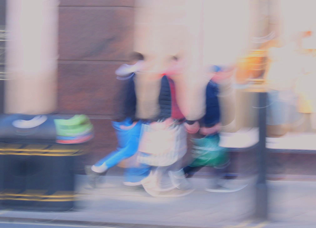
I took these photos around Oxford Street trying to recreate Humphris's work by moving the camera and playing around with the ISO. I was unsure of what ISO to use as some photos turned out white while some turned out black. It was challenging to find the right settings but I eventually settled on around an ISO of 400. I took 1 or 2 photos with one woman focused while everyone else was blurry and I thought that was quite cool. It took me around 30minutes to get my final images. As Alan Humphris said, his aim was to 'abstract away the details so the images are non-specific'. I understand when he says this as if I had taken these same photos focused I wouldn't have noticed certain objects and people. |
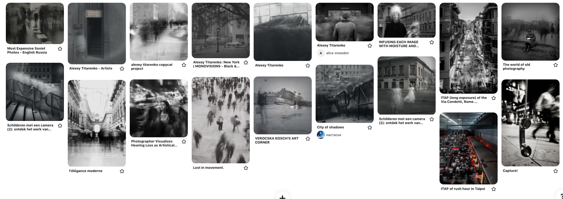
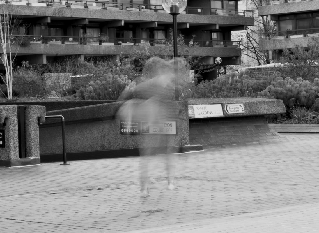
2nd Strand - Alexey Titarenko
Titanrenko also uses long exposure however he places his camera on a tripod and exposes for several minutes instead. In one of his posts it tells us that 'the exposure time exceeded several minutes'. However he used a 'Hasselblad 500C' which is quite an old camera, with a digital camera we would only need to expose for around 30-40 seconds instead.
To him it felt as though the result of the photo depicted the crowd as a general movement with erased secondary movements, it was a metaphor created by the long exposure. Alexey said that the elements that stayed fixed, such as hands on a a stairway rail, moved him, provoking in him an intense emotional pain as well as a wave of love towards the crowd. The mass of indistinct faces brought several episodes to mind such as wars and revolutions that the Russians had suffered throughout their history. It was as if one photograph had embraced a decade or even a century.
To him it felt as though the result of the photo depicted the crowd as a general movement with erased secondary movements, it was a metaphor created by the long exposure. Alexey said that the elements that stayed fixed, such as hands on a a stairway rail, moved him, provoking in him an intense emotional pain as well as a wave of love towards the crowd. The mass of indistinct faces brought several episodes to mind such as wars and revolutions that the Russians had suffered throughout their history. It was as if one photograph had embraced a decade or even a century.
My Response:
|
|
|
|
|
|
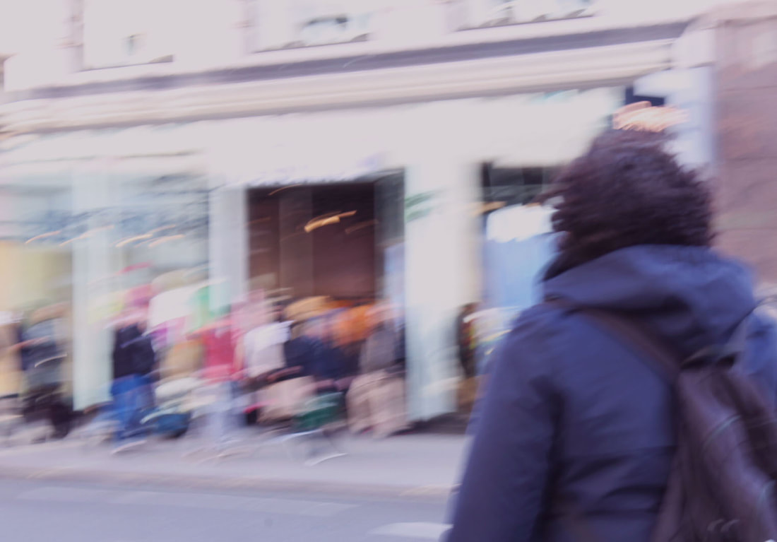
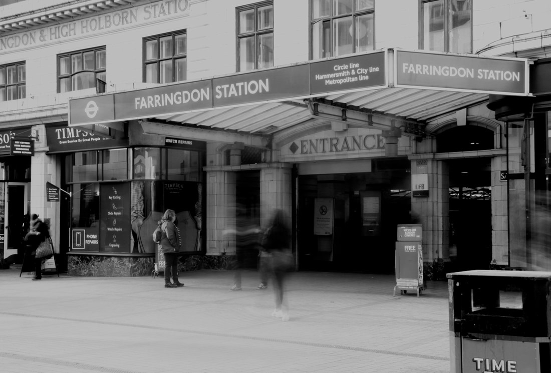
Analysis:
I really enjoyed taking the images for this project, I brought a tripod and camera outside and set it up. I let the camera expose for around 20-30 seconds and my images came out like this. At first they were too bright but I learnt how to manage the camera settings and this was the final result. I am quite happy with my results as my background is perfectly still while any moving subject is captured doing exactly that, moving. To me my images help slow down time and take in the moment, it makes you look at someone more closely and see them go about their day, normally you wouldn't even notice the person walking by you but as I was capturing these images, it made me rethink the people around me and acknowledge how every person has a different motive and place to be.I would love to try this again, this time going to a more quiet area with few people and then a different area that is busy.
I really enjoyed taking the images for this project, I brought a tripod and camera outside and set it up. I let the camera expose for around 20-30 seconds and my images came out like this. At first they were too bright but I learnt how to manage the camera settings and this was the final result. I am quite happy with my results as my background is perfectly still while any moving subject is captured doing exactly that, moving. To me my images help slow down time and take in the moment, it makes you look at someone more closely and see them go about their day, normally you wouldn't even notice the person walking by you but as I was capturing these images, it made me rethink the people around me and acknowledge how every person has a different motive and place to be.I would love to try this again, this time going to a more quiet area with few people and then a different area that is busy.
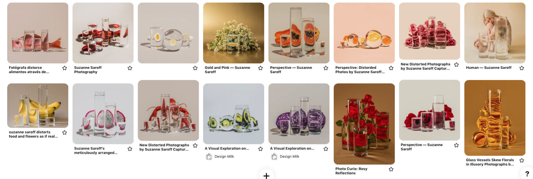
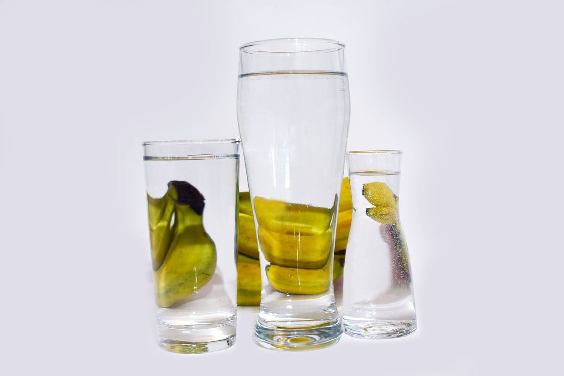
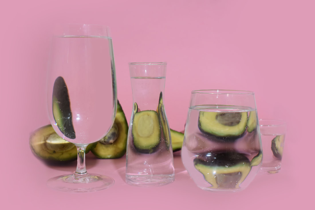
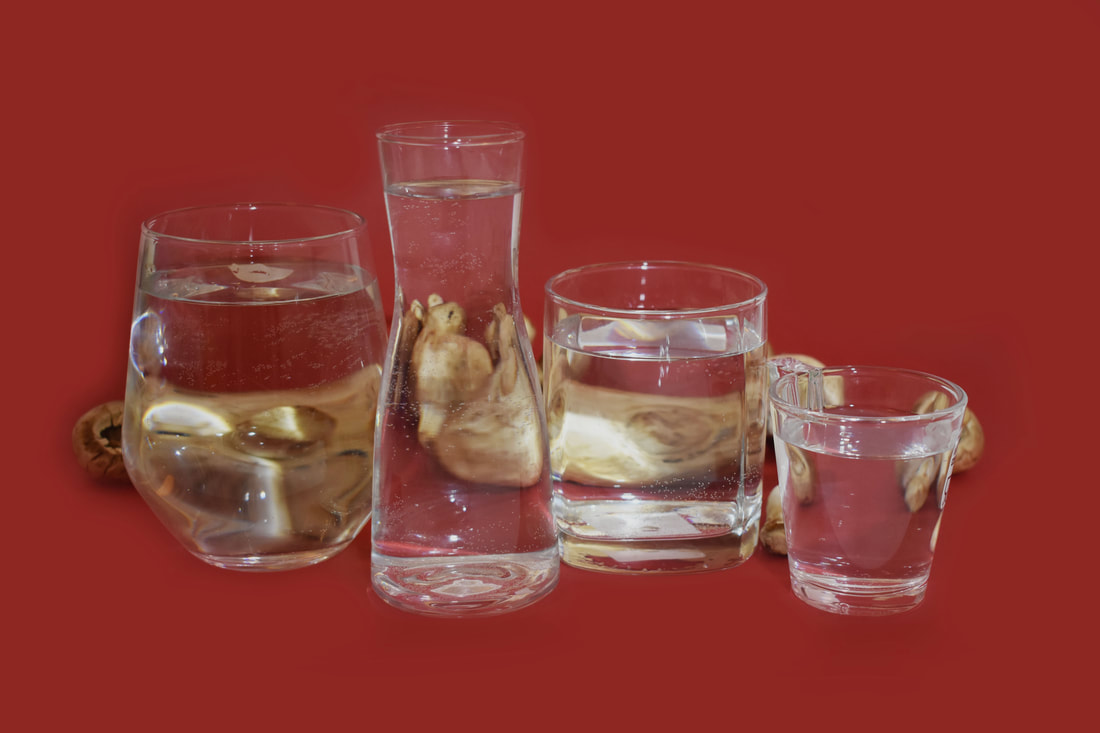
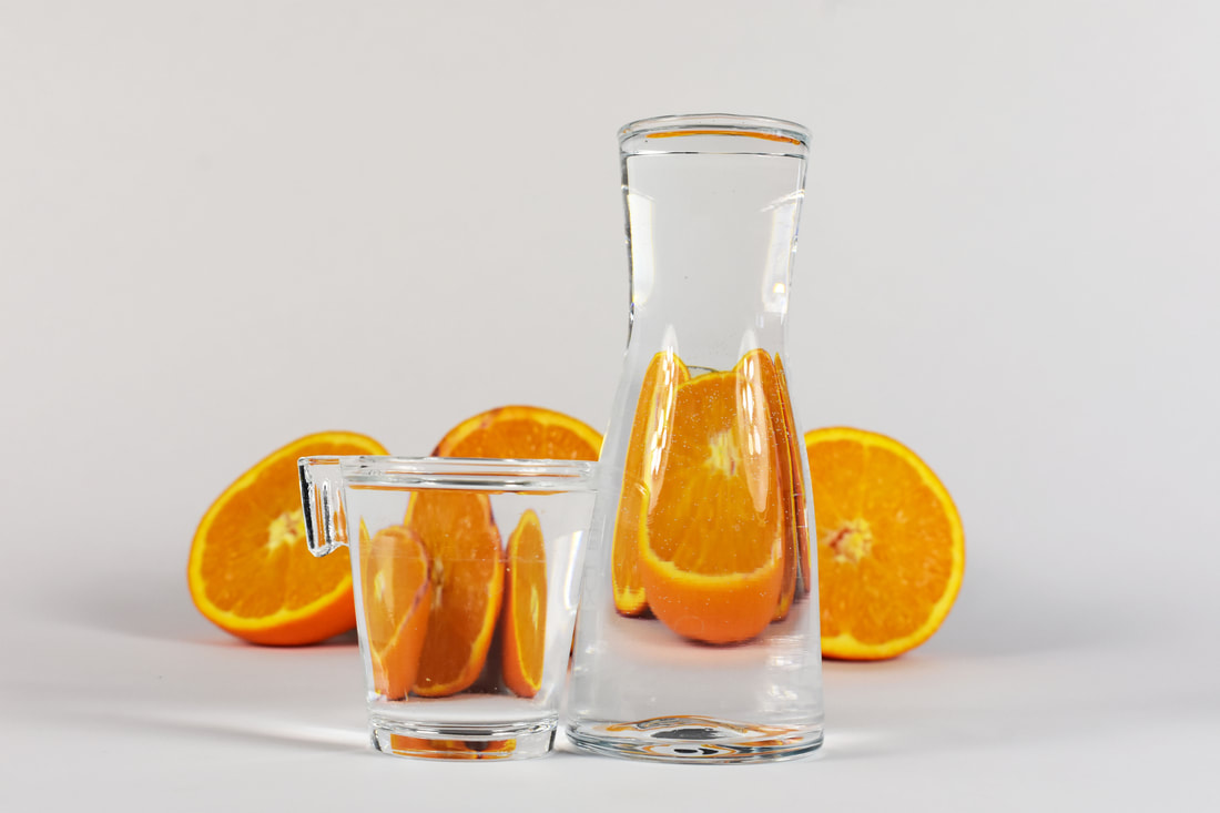
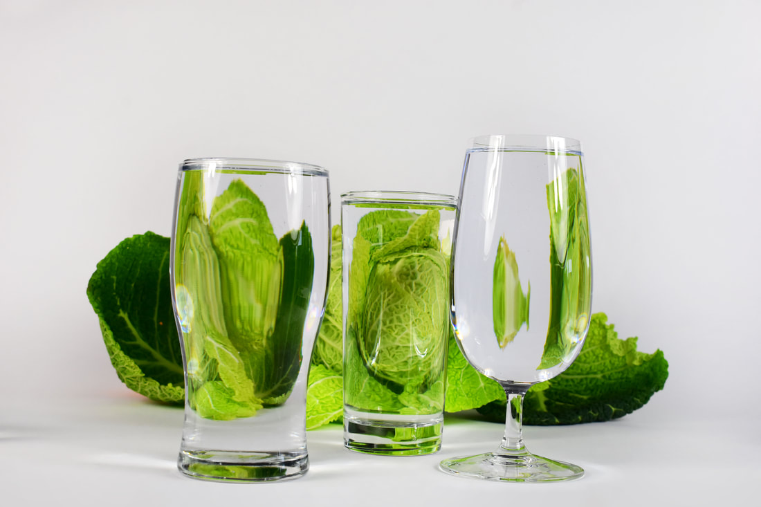
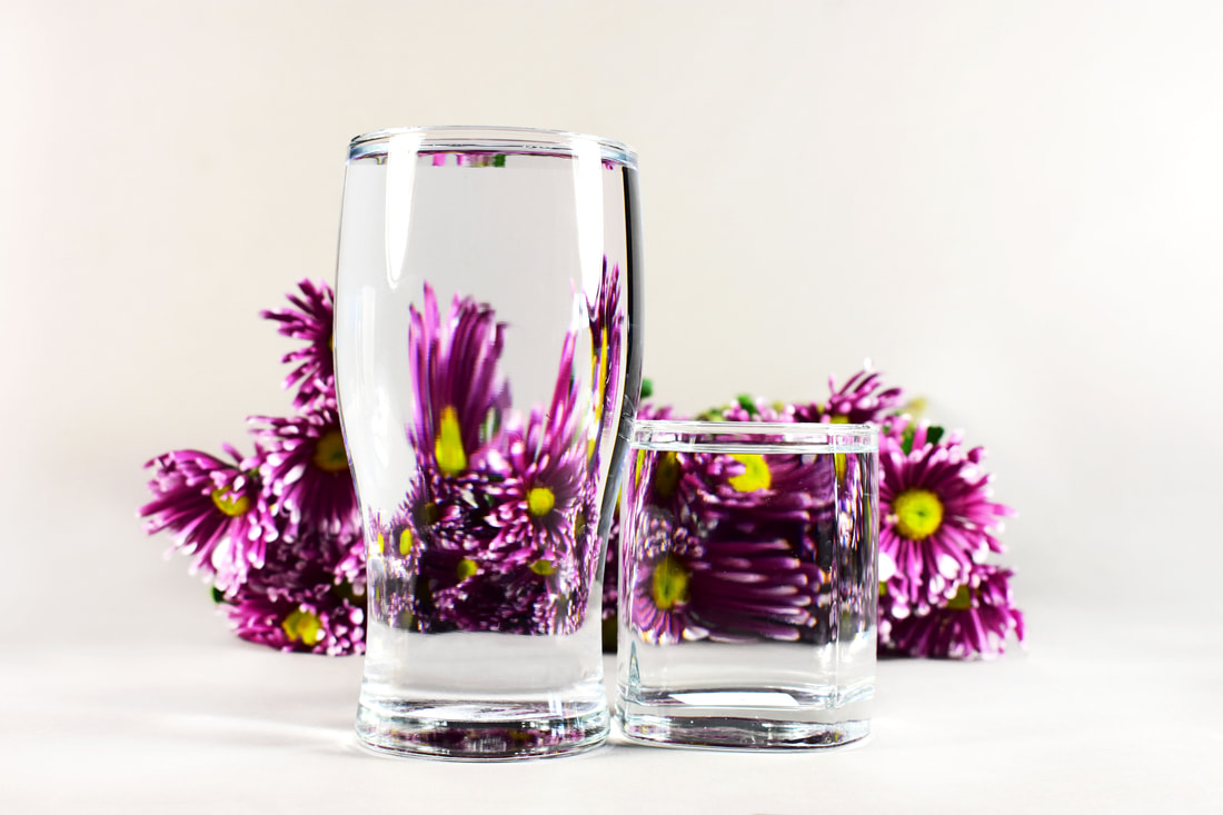
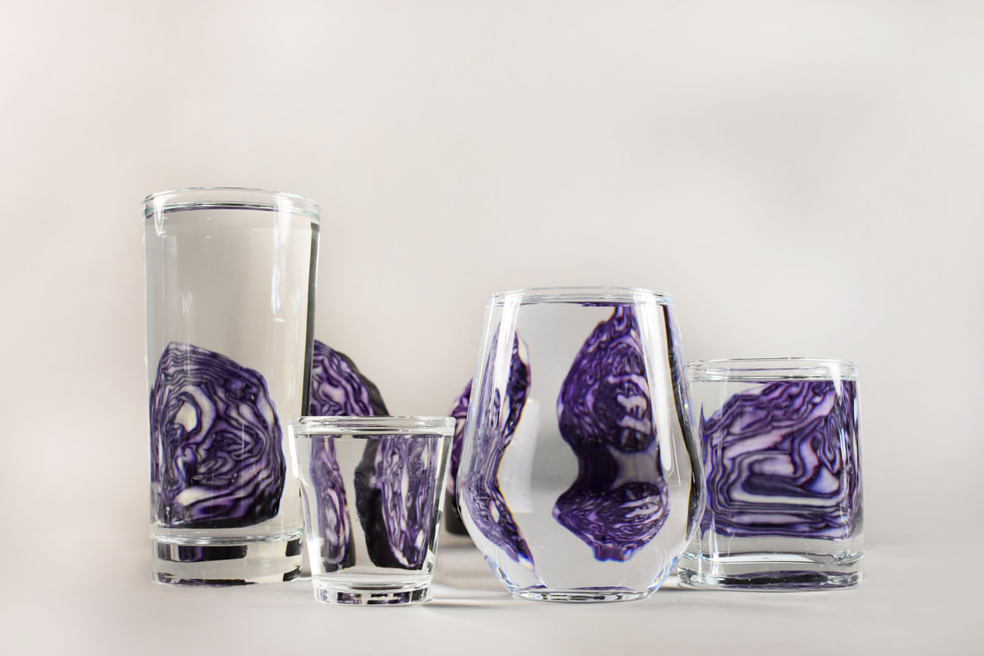
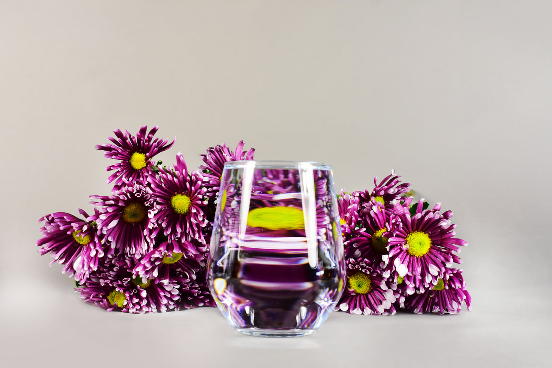
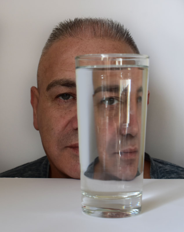
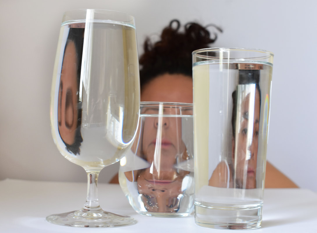
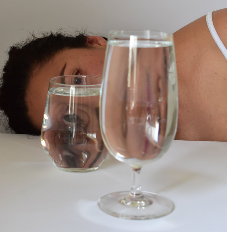
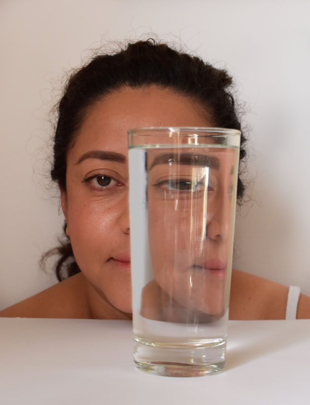
3rd Strand - Suzanne Saroff
In Suzanne Saroffs photos, she arranges natural objects such as plants, fruits and vegetables behind clear water glasses and vases of all shapes and sizes. She sets them against neutral backgrounds. In this way, she makes objects appear multiplied, stretched and flipped as they dance within the walls of the overlapping glasses.
She will often feel drawn to something she sees or be inspired by a memory and have an urge to shoot it. To Suzanne, colour is very important to her when choosing objects to shoot. She likes to play with how they look on various shades of neutral backgrounds.
She will often feel drawn to something she sees or be inspired by a memory and have an urge to shoot it. To Suzanne, colour is very important to her when choosing objects to shoot. She likes to play with how they look on various shades of neutral backgrounds.
My Response:

|
|
|
|
|
|
|
|
|
|

|
|
Analysis:
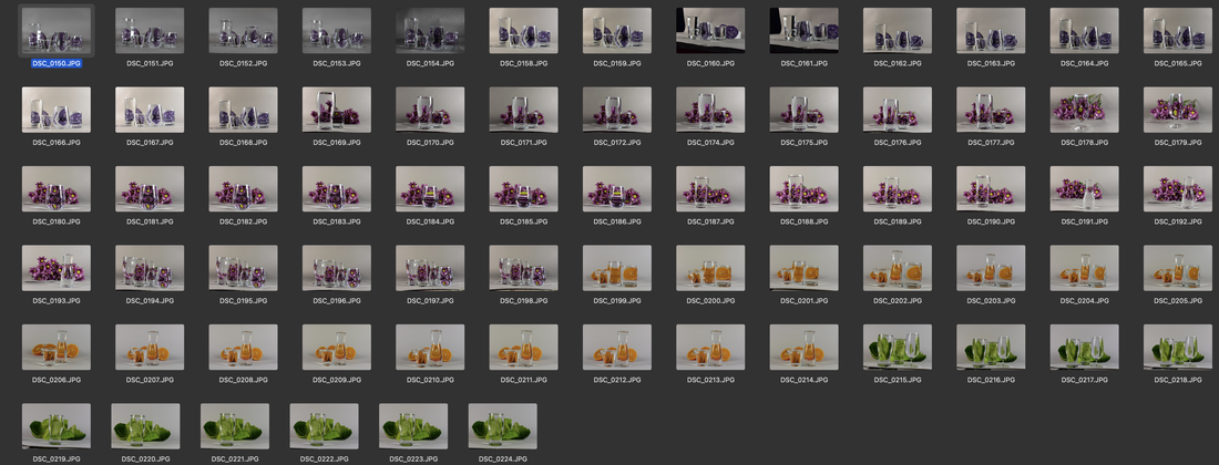
for this project, I went to the supermarket and bought a couple of different, fruits, vegetables and flowers. I then set up different coloured sheets as a background and filled up several different glasses with water up to the brim. I started taking my images and remained at eye level for all of the pictures. In photoshop I mostly just brightened up the images. I found the project overall quite exciting. It allowed to explore how different objects can be distorted with such a simple factor; water. This project inspired me to make. my further development which turned out quite great.
for this project, I went to the supermarket and bought a couple of different, fruits, vegetables and flowers. I then set up different coloured sheets as a background and filled up several different glasses with water up to the brim. I started taking my images and remained at eye level for all of the pictures. In photoshop I mostly just brightened up the images. I found the project overall quite exciting. It allowed to explore how different objects can be distorted with such a simple factor; water. This project inspired me to make. my further development which turned out quite great.
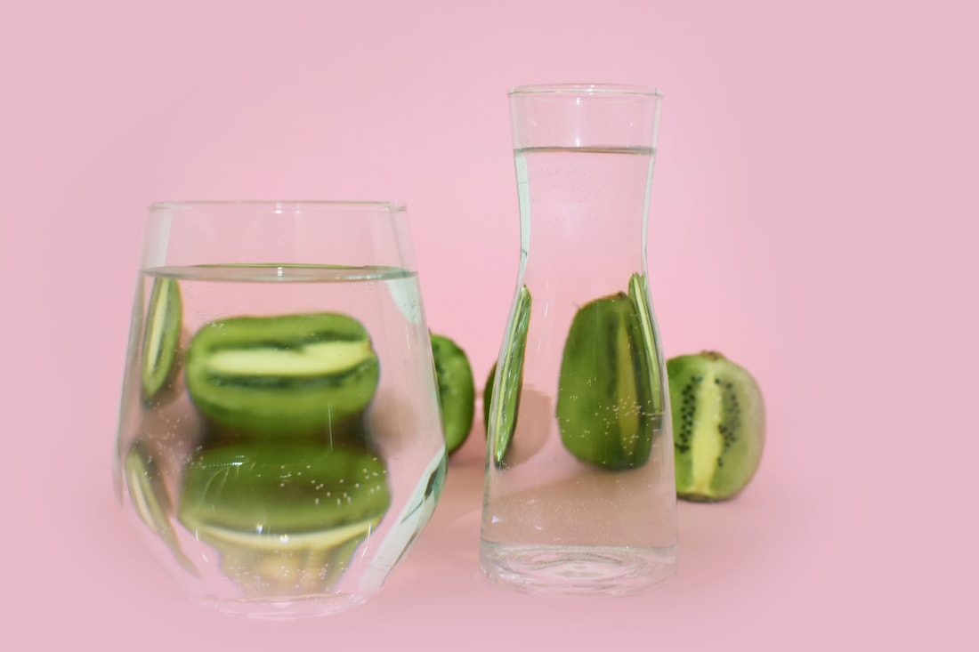
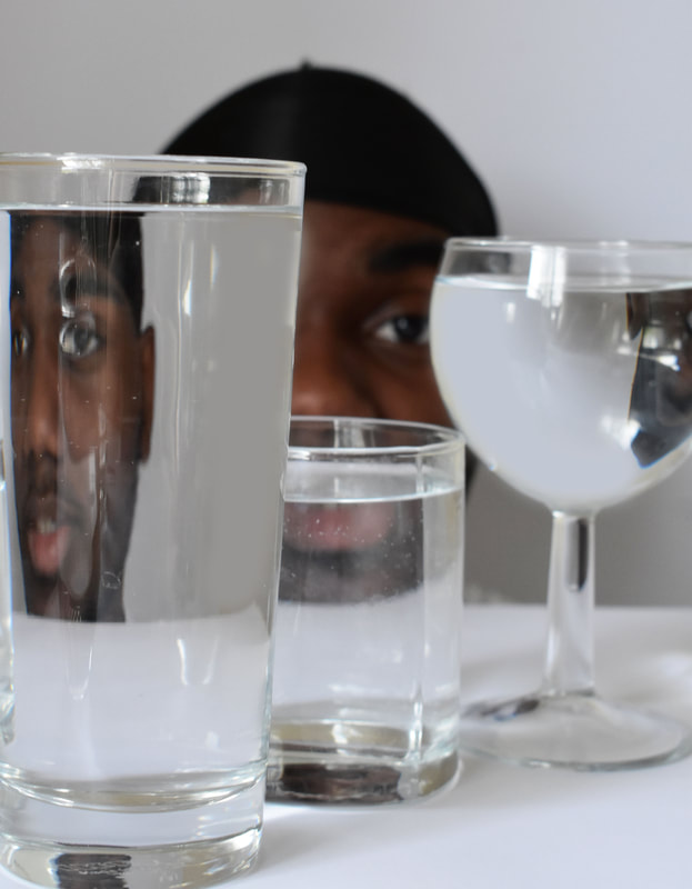
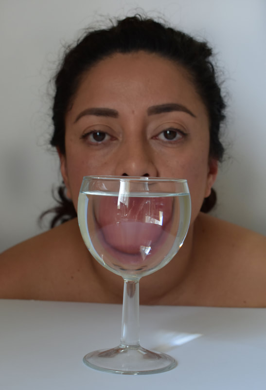
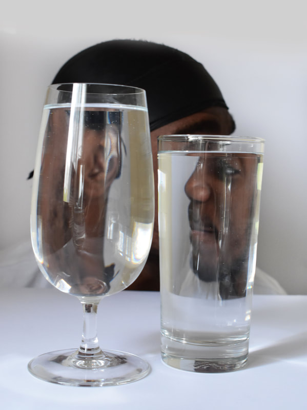
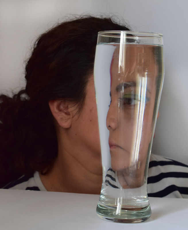
Further Development of 3rd Strand
I chose to develop Suzanne Sarnoff as my final strand because I really enjoyed the process of taking the pictures and the effect of the glasses filled with water created a distortion. Instead of doing food, Ill be doing peoples faces instead. I feel like I could capture certain features of my subjects face, such as the eyes and skin.
My Response:

|

|

|
|
|
|
|
|
|
|

|
|
